Top 4 Popular Big Data Visualization Tools
-
7908
-
1
-
21
-
0
Reading the streams of numbers is possible only in the movies. In the real world, the businesses have to use data visualization tools to get the trends and patterns out of the raw data.
Big Data visualization is among the utmost important components of working with various Big Data analytics solutions. Once the flow of raw data is represented by images, decision making becomes much easier. In order to meet and exceed the customer’s expectations, the tools for Big Data visualization should provide a certain set of features:
- Capability to process multiple types of incoming data
- Capability to apply various filters to adjust the results
- Capability to interact with the data sets during the analysis
- Capability to connect to other software to receive incoming data or provide input for them
- Capability to provide collaboration options for the users
Despite the fact there is a ton of specialized tools for Big Data visualization, which are both open-source and proprietary, there is a bundle of them that stands out quite a bit, as they provide all or many of the aforementioned features. We will describe 4 most popular tools for Big Data visualization to help you choose the perfect fit for your case.
Jupyter: a one-stop shop for Big Data visualization
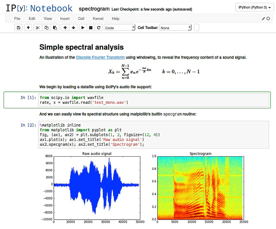
JupyteR is an open-source project enabling Big Data analysis, visualization and real-time collaboration on software development across more than a dozen of programming languages. The interface holds the field for code input, and the tool runs the code to deliver the visually-readable image based on the visualization technique chosen.
However, this is barely the tip of the iceberg. Jupyter notebooks can be shared amongst the team to enable internal collaboration and boost the teamwork on the data analysis. They can be uploaded to GitHub or Gitlab to enable public collaboration on the results, they can be included in a Docker container using Kubernetes and can be run on any other machine with Jupyter. While being initially using Python and R, Jupyter Notebook is actively introducing kernels for other programming languages like Java, Go, C#, Ruby, and many others.
The ability to interact with multiple frameworks like Spark turns Jupyter into an all-around capable solution for processing the data from large, data-intensive applications with disparate sources of input.
Tableau: the best solution for visualizing AI, Big Data and Machine Learning apps
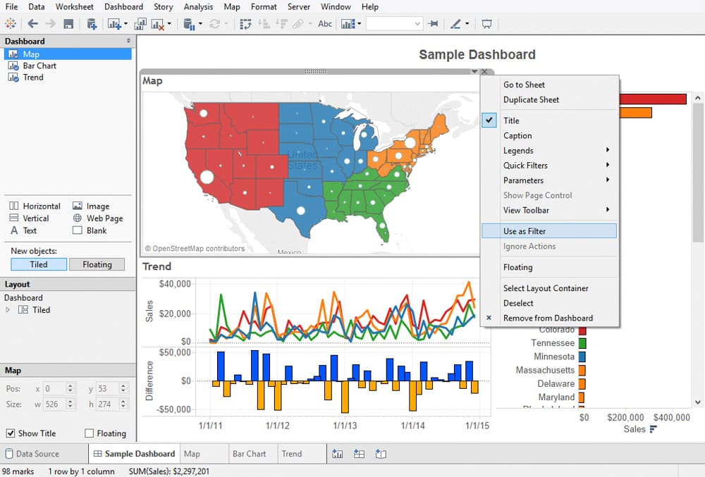
Tableau is amidst the market leaders for the Big Data visualization, especially efficient for delivering interactive data visualization for the results derived from Big Data operations, deep learning algorithms and multiple types of AI-driven apps.
Tableau can be integrated with Amazon AWS, MySQL, Hadoop, Teradata, and SAP, making this solution a versatile tool for creating detailed graphs and intuitive data representation. This way the C-suite and middle-chain managers are able to make grounded decisions based on informative and easily-readable Tableau graphs.
Google chart: a free and powerful integration of all Google power
Google is the synonym for leadership nowadays, and just as Google Chrome is undoubtedly the most popular browser out there, Google chart is amidst the best solutions for visualization of big data, not to mention it is completely free and receives eager support from Google. Why so? Because the data parsed through this solution is used to train Google’s AI, obviously, so it’s a win-win situation for all parties.
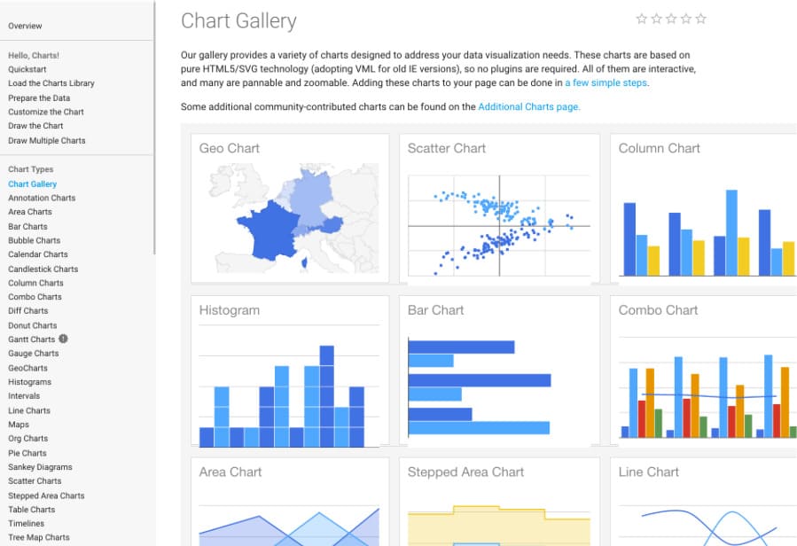
Google chart offers a plethora of visualization types, from simpler pie charts and time series, all the way up to multi-dimensional interactive matrixes. Adjustment options are numerous and an extensive help section is available if deep customization is requested.
The tool is rendering the resulting charts to HTML5/SVG, so they are compatible with any browser. Support for VML ensures compatibility with older IE versions, and the charts can be ported to the latest releases of Android and iOS. What’s even more important, Google chart combines the data from multiple Google services like Google Maps. This results in producing interactive charts that absorb data real-time and can be controlled using an interactive dashboard.
D3.js: visualize the Big Data in literally any way you need
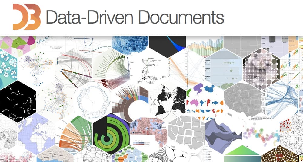
D3.js stands for Data-Driven Document, a JS library for interactive Big Data visualization in literally ANY way required real-time. This is not a tool, mind you, so a user should have a solid understanding of Javascript to work with the data and present it in a humanly-understandable form. To say more, this library renders the data into SVG and HTML5 formats, so older browsers like IE7 and 8 cannot leverage D3.js capabilities.
The data gathered from disparate sources like huge-scale data sets is bonded in real-time with DOM to produce interactive animations (2D and 3D alike) in an extremely rapid way. The D3 architecture allows the users to intensively reuse the codes across a variety of add-ons and plug-ins.
Final thoughts on Big Data visualization tools
This is but a scratch of a plethora of solutions and tools for Big Data visualization, both online and standalone. Each company is able to find the tool that works best for them and helps them turn the raw data input into a collection of clearly understandable images and graphs. The data has no value on itself, it’s the decisions it helps making that drive value — and data visualization tools help identify the trends and patterns in order to make grounded decisions.
We hope you found our series on Big Data visualization principles, techniques and tools useful and entertaining. If so, please share it with friends! If you have any questions or need a consultation on what tool fits your needs best — contact us and we will be glad to help!
