Big Data visualization principles
-
11958
-
1
-
2
-
0
Big Data visualization is undoubtedly the most essential part of Big Data analytics. Instead of drowning the user in unstructured data, visualization helps provide the actionable insights.
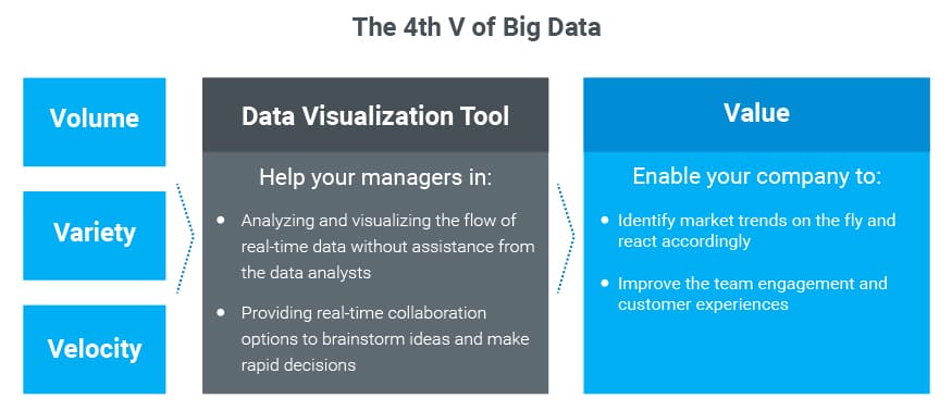
We have spoken of three V’s in Big Data quite a lot, as it is one of the most popular paradigms in the domain. It’s worth keeping in mind, however, that while big volume, variety, and velocity are indeed essential, the most important part of Big Data is the 4th V — the value it delivers. Bricks of reports with a multitude of tables full of numbers are worth nothing if the users cannot find the trends and patterns within.
This is where Big Data visualization kicks in, delivering several important benefits:
- It allows discovering the patterns not traceable otherwise. When the information is represented in form of graphs, pie charts, diagrams, scatter plots and other visual methods, the end users can discover the hidden trends and patterns
- Data visualization helps find answers to many questions faster. People are better at comprehending a line on a graph than a column of numbers
- Data volumes grow exponentially. Analyzing endless rows and columns of numbers is literally impossible if they are not transformed into some kind of visual image
- Good Big Data visualization tools are interactive, allowing the users to adjust the analysis boundaries on the go, tweak and manipulate the data sets to extrapolate various results, etc.
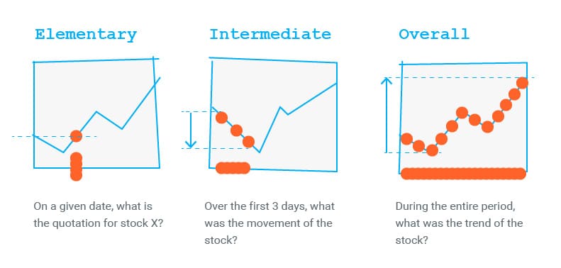
In terms of visualization, the image is the meaningful visual form a human can understand with the least effort and in the shortest time. This definition was given by Jacques Bertin in his Magna Carta — Semiology of Graphic, the deskbook for all generations of data analysts to come. Bertin has also defined 3 levels of information comprehension: elementary, intermediate and overall.
- The elementary level allows comprehending the information at any given point in time
- The intermediate level helps analyze some period
- The overall level enables comprehension of the entire picture over the whole period
Thus said, a well-designed Big Data visualization helps us answer queries on any comprehension level in minimal time, thus being an example of an image.
We will describe the most commonly used techniques for data visualization in an upcoming article. We hope this article was interesting and useful for you, so please share it with the friends and colleagues! Should you have any more questions on the topic — feel free to ask them away in the comments below or drop us a line, we are always happy to help out!


