IT Svit Global Update
-
2511
-
0
-
0
-
0
Hello everyone!
Today is a great day and we proud to announce a brand new version of our corporate website!
Since our mission states, IT Svit is an unrivaled provider of superior solutions for your ideas. This imposes certain obligations towards our customers who are waiting for guaranteed level of services according to SLA. That’s why we just can’t stop learning.
For the last couple of months we have made significant progress in studying new technologies related to cloud, clusterization and virtualization/containerization that were on top of trends across the Internet. This included: Kubernetes, DC/OS, MesOS, Platform.sh, proxysql, various Docker combinations (including Docker Swarm), Cloud solutions (both public and private) of different hosting providers, etc. More information about these technologies you can find on our DevOps services page.
All these advancements have lead to the situation when the main website was no longer relevant to new skills and didn’t reflect our new strengths. So the idea of revising the website was the #1 priority.
After several weeks of hard work we finally did it!! As you can see now, the website looks gorgeous, very stylish and modern.
Front-End
One cool thing about this update is that our website is now fully-responsive (Pfff, not very impressive feature nowadays, right? 🙂 ), however, this wasn’t available before on the old CMS. There are some pixel-perfect modifications left, but even though the site looks great.
Sections
On the front-end our technical writers and content managers updated all the sections describing our new portfolio of services and got rid of irrelevant and obsolete ones. So, now the “Our Services” section reflects the most recent and up-to-date information. The only thing that looks a bit incomplete here is the information structure. But… We have already found a perfectly suitable way of presenting information about our services and these updates are on their way.
Another innovation is the Partners page that was in its initial state on the old site. Now, we combine information about our key partners in one place in order to emphasize the importance of effective communication, exceptional level of service and, as the result, trusted partnership.
In addition, as the part of global redesign, we migrated our blog to integrate it with the new corporate design and provide users with seamless experience and eliminate unnecessary movements through sites. Now, all our articles are located under the Blog category.
Back-End
Under the hood we have a new CMS engine (outdated Joomla has finally been retired) with a custom theme, professionally developed with passion and love by our designers and developers with a keen attention to details.
The new theme was also developed with functionality in mind, which now allows us to add new content (e.g. news, updates, articles), skills, projects or other valuable information almost on the fly without having to go deep into the jungle of hierarchical structure of menus, sections and pages like it was before.
On the technical side, the new website was finely tuned to enhance performance and minimize possible delays in page loads. At this moment, we reached good results:
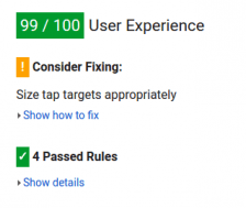
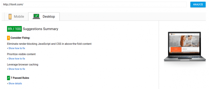
Google Insights: 89/100 – total score and 99/100 – User Experience.
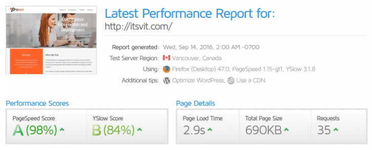
GTMetrix: Page Speed Score – 98% (A), YSlow Score – 84% (B)
Pingdom Tools: Performance grade – 94% from different locations across the Globe with 2.42 s of Load Average Time.
Not bad indeed, however, some minor improvements are still in progress.
Summing up all the above, the final result is enjoyable – fresh look and feel coupled with extended list of provided services, as well as huge motivation to move forward and keep an edge over our competitors! Pure freedom!


